Inthis article, I’m going to share with you the notebook of the challenge in Mini-Bootcamp: Data Visualization in Matplotlib by AI Planet and then we are going to evaluate the whole content of the bootcamp.
For your reference, AI Planet is a Data Science community that offers free courses, bootcamps, challenges, live sessions and more in order to start your career in Data Science.
Tutorial
Overview
In this project, the 2021 world happiness report has been given as an assignment. In more detail:
The World Happiness Report 2021 focuses on the effects of COVID-19 and how people all over the world have fared. The objective of the report was two-fold, first to focus on the effects of COVID-19 on the structure and quality of people’s lives, and second to describe and evaluate how governments all over the world have dealt with the pandemic.
About the dataset
The dataset contains information about 149 different countries all over the world. There are 20 different attributes/variables that provide information on each country’s world happiness report scores for the year 2021. The happiness study ranks the nations of the world based on questions from the Gallup World Poll. The results are then correlated with other factors, including GDP and social security, etc.
- Country name: Name of the country.
- Regional indicator: Region the country belongs to.
- Ladder score: Changes in well-being. Happiness score or subjective well-being.
- Standard error of ladder score: Changes of well-being based on standard errors clustered at the country level.
- upperwhisker: Age 60+
- lowerwhisker: Age < 30
- Logged GDP per capita: Economic production of a country. The statistics of GDP per capita.
- Social support: Social support (or having someone to count on in times of trouble) is the national average of the binary responses (either 0 or 1) to the GWP question “If you were in trouble, do you have relatives or friends you can count on to help you whenever you need them, or not?”
- Healthy life expectancy: Rank of the country based on the Happiness Score.
- Freedom to make life choices: The extent to which Freedom contributed to the calculation of the Happiness Score.
- Generosity: Generosity is the residual of regressing national average of response to the GWP question “Have you donated money to a charity in the past month?” on GDP per capita.
- Perceptions of corruption: Absence of corruption.
- Ladder score in Dystopia: A social evil lead to inhumanized or fearful lives for the people.
- Explained by: Log GDP per capita: Explaining economic status of a country by comparings GDPs.
- Explained by: Social support: Social factors and social behaviors — including the quality and quantity of people’s social relationships — have also been shown to protect well-being during the pandemic.
- Explained by: Healthy life expectancy: The objective benefits of happiness.
- Explained by: Freedom to make life choices: Perceived freedom to make life choice.
- Explained by: Generosity: Importance of ethics, policy implications, and links with the Organisation for Economic Co-operation and Development’s (OECD) approach to measuring subjective well-being and other international and national efforts.
- Explained by: Perceptions of corruption: Weight score due to involving in some kind of corruption by a country.
- Dystopia + residual: Psychological factors indicating some kinds of suffering in a society and lead to mental health problem.
Import Libraries
We will need pandas to read and process our data and matplotlib to create data visualization graphs.
import pandas as pd
import matplotlib.pyplot as plt
The tasks
- Load the data file name it as: df1
- Display the first 5 rows
- Display a concise summary of the provided data and list out 2 observations/inferences that you observe from the result.
- Display the descriptive statistics
- Is there any missing values in each column of the provided dataset
- Display all the unique countries of Western Europe
- Filter and display the world happiness report score for the country India in year 2021
- Build a line plot that shows the variation of Ladder score among the 5 Southeast Asian countries
- Create a dataframe object: df_2021 with the following countries: ‘China’, ‘Nepal’, ‘Bangladesh’, ‘Pakistan’, ‘Myanmar’, ‘India’, ‘Afghanistan’ and build a scatter plot to show the relationships of these countries vs their Logged GDP per capita
The code
We will start by loading the data, display the first 5 rows and provide information:
df1 = pd.read_csv(‘https://raw.githubusercontent.com/dphi-official/Datasets/master/world-happiness-report-2021.csv’)
df1.head(5)
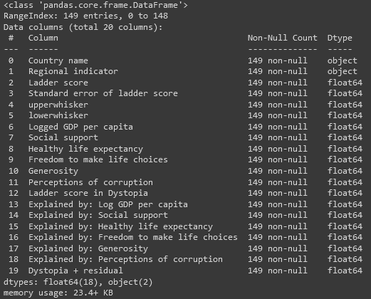
df1.info()


What we are observing from the information provided is that we don’t have empty/null values, as well as two of the columns are of data type object, and the rest are float.
With Descriptive Statistics we can get some insights about the data. For example, if we look at the min, max and mean of Ladder Score we see that the min is about 2.5, the max 7.84 while the mean is at the middle of those two numbers (5.53). So, someone can say that it seems that the people living in these countries that we have some data, are half of them happy/satisfied and half of them kind of unhappy/unsatisfied.
df1.describe()

Then, we search for empty values in each of the columns:
df1.isnull().sum()
While we have the information if there are any missing values from df1.info(), we can do the following by the code above, where 0 means there is no empty value.

What really help me conduct my analysis and make my life easier, is to rename some of the columns in order to be more code-friendly.
df1.rename(columns = {‘Regional indicator’: ‘region’, ‘Country name’: ‘country’, ‘Ladder score’: ‘happiness_score’, ‘Explained by: Social support’: ‘social_rels’, ‘Logged GDP per capita’: ‘GDP_per_capita’ }, inplace=True)
The unique countries of Western Europe (EU) are provided by the following code:
weu_countries = df1[df1.region == ‘Western Europe’].country.unique()
print(‘Unique countries of Western EU: \n’, weu_countries)

The happiness score for India on 2021:
print(‘The happiness score for India is: ‘,list(df1[df1.country == ‘India’].happiness_score)[0])
Of course, if you look at the initial task, it asks for India and for year 2021. This can be misleading at first searching for a column in our data to filter by year. However, if we look again at the About Dataset section we will understand that all of our data refer to 2021.
The happiness score for India is: 3.819
Let’s now dive into the Data Visualization world and especially get to know Matplotlib library:
plt.rcParams[“figure.figsize”] = (15,5.5)
southeast_asia_5 = df1[df1.region == ‘Southeast Asia’].sort_values(by=’happiness_score’, ascending = False).head(5)
plt.plot(southeast_asia_5.country, southeast_asia_5.happiness_score, color=’Red’, marker = ‘o’)
plt.title(‘Happiness Score among top 5 Southeast Asia Countries’)
plt.xlabel(‘Country’)plt.ylabel(‘Happiness Score’)
plt.show()
The first line of code is to make the resulting line plot bigger (15 width, 5.5 height). This is because the country names are big enough and the resulting graph won’t be readable. Then, we filter our data by bringing only data for Southeast Asia regions and sort them in descending order in order to get the top 5 (head(5)). Finally, we create the line plot by giving the Country Name at the x-axis, the Happiness Score (Ladder Score) at the y-axis.
As an extra step, we changed the color of the line to red and the marker to a bolder point (o). Then, we gave a title to our graph and we named both x and y axes.

As far as the last task, we filter the dataset by showing only data from the countries mentioned and then we did the same steps as before but now creating a scatter plot.
plt.scatter(df_2021.social_rels, df_2021.GDP_per_capita, color=’Purple’, marker = ‘^’)
plt.title(‘Social Relationships vs Logged GDP per Capita’)
plt.xlabel(‘Social Relationship’)plt.ylabel(‘Logged GDP per Capita’)
plt.show()

If we go one step further, we will see at tour data that it seems that there is no linear relationship between those two variables.
Conclusion
The challenge given is defined by AI Planet as easy and I can agree with this. However, the course content is very informative and give detailed information about Data Visualization and features of Matplotlib library. With that being said, I totally recommend start learning the Matplotlib library of Python through this mini-bootcamp that is being offered almost all the year.
Finally, I have to admit that I truly enjoy the educational content from AI Planet because it really gives the person a very good introduction to many aspects of Data Science. Of course, this is only the start of an amazing journey and AI Planet just gives the opportunity to start from somewhere and especially to gain hands-on experience which is the most important in order to land a job in Data Science!
Disclaimer:
The author of the notebook is Chintoo Kumar, the contributor is Chanukya Patnaik and the code/answers are written by me.
AI Planet, thanks a lot for all the educational content that you are constantly creating and help people gain confidence and experience in Data Science.

